Decorating your home is fun and exciting, but it can also be tricky to get things just right. For a lot of people, one of the trickiest parts of decorating is choosing a color palette.
There is one simple trick that you can use to make choosing colors for your home a little easier, though. It’s called the 60-30-10 Rule.
What is the 60-30-10 Decorating Rule?
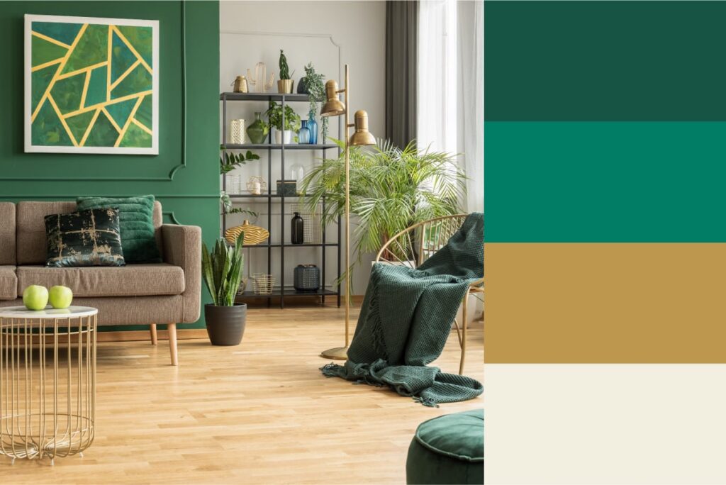
This design rule is more of a guideline to help you create color palettes when decorating rooms in your home. The numbers 60, 30, and 10 refer to the percentage of each color or color family that will be present in that room:
60% should be the main color family used in your room. Your sofa, rugs, walls, and largest accent pieces should be in this color scheme.
30% will be your secondary color. The items that fall into this category include your accent furniture like side chairs, as well as curtains and painted furniture.
The remaining 10% will be the color of small accents like throw pillows, decorative accessories, art, and lamps.
Using this decorating rule is a simple way to ensure your room has a cohesive but visually interesting color scheme.
Creating Color Schemes
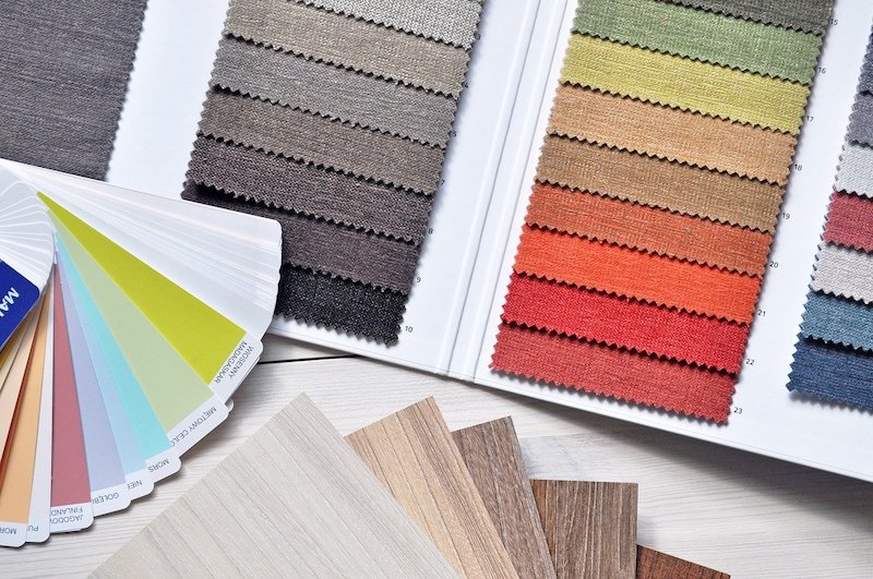
Check out more tips and tricks for creating color palettes for your home!
How to Choose Colors in Interior Design
Now that you know how to set up your color palette ratio, let’s talk about how to choose the colors themselves. We’ll refer to the color wheel to do this:
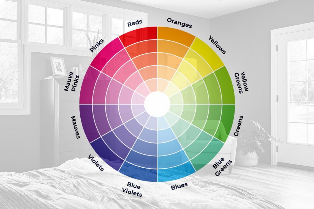
Complementary Colors
Let’s start with the color wheel. Colors that appear directly across from each other on the wheel are complementary and balance each other beautifully. Complementary color schemes include:
- Blue & orange
- Red or pink & green
- Yellow & purple
Add in a neutral like beige, white, or grey and you have an instant color palette for your home!
Analogous
Instead of choosing colors directly across from each other on the color wheel, choose three colors that are next to each other on the wheel. The middle color will be your dominant color as it ties the other two together. Examples of analogous color schemes include:
- Yellow-orange, yellow, and yellow-green
- Blue, blue-green or teal, and green
- Red, red-violet, and violet
Monochromatic
Try different shades of the same color for a monochromatic, but not boring, color palette for your home. Examples include:
- Brown, tan, and light beige or cream
- Charcoal grey, medium grey, and light grey
- Navy blue, powder blue, and palest blue
Upgrade Your Home With Window World
If decorating has led you to look at other ways to improve the look and feel of your home, we’re here to help! Our energy-efficient windows, doors, and siding add curb appeal and help regulate your interior temperatures for a more comfortable living space. Get started by requesting your free consultation today!